semester
KG3
lecturer
Prof. Daniel Utz
Stefan Kraiss
team
Celine Andrysiak
tools
Webflow
Adobe Illustrator
Figma
Information and Web Design
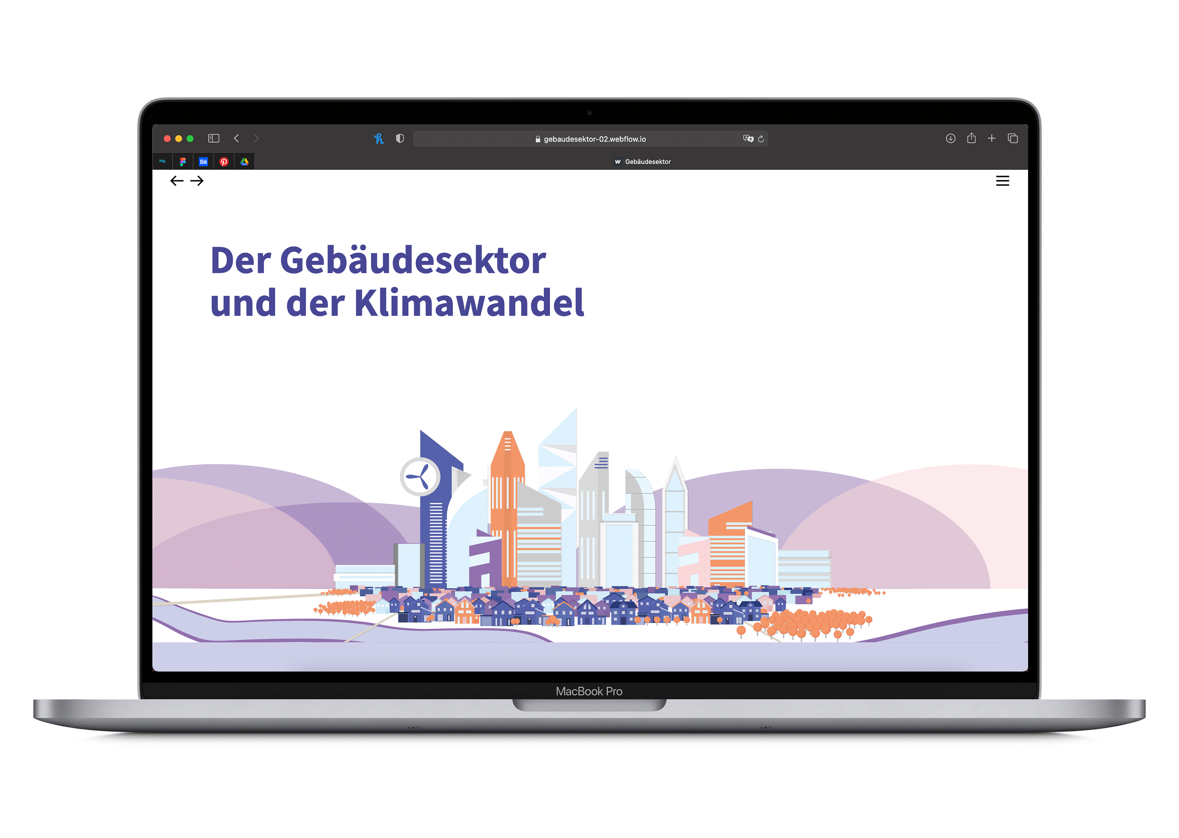
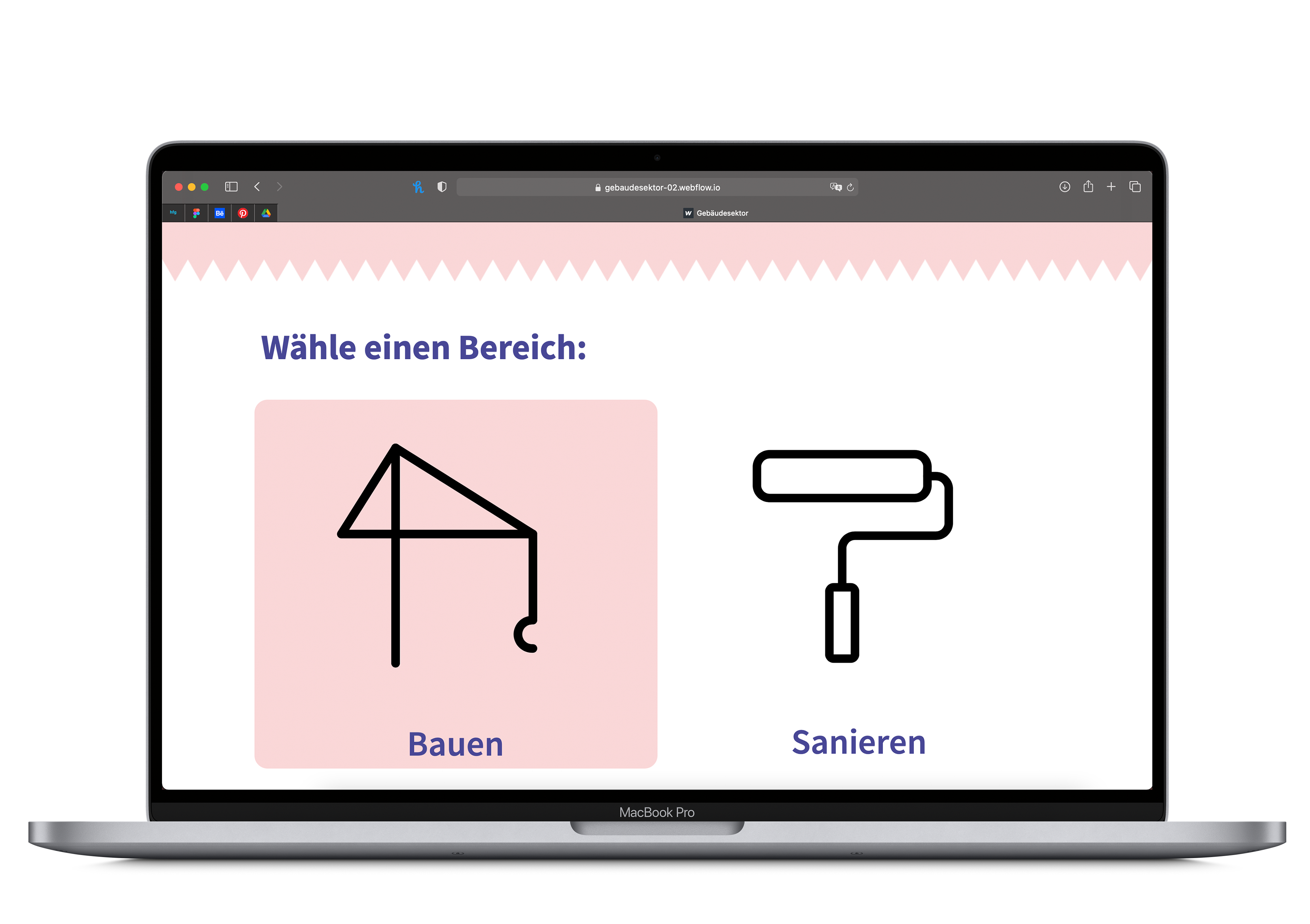
In the course “Information Visualization”, we created an informative web page filled with data sets and graphics on climate change in a group project.
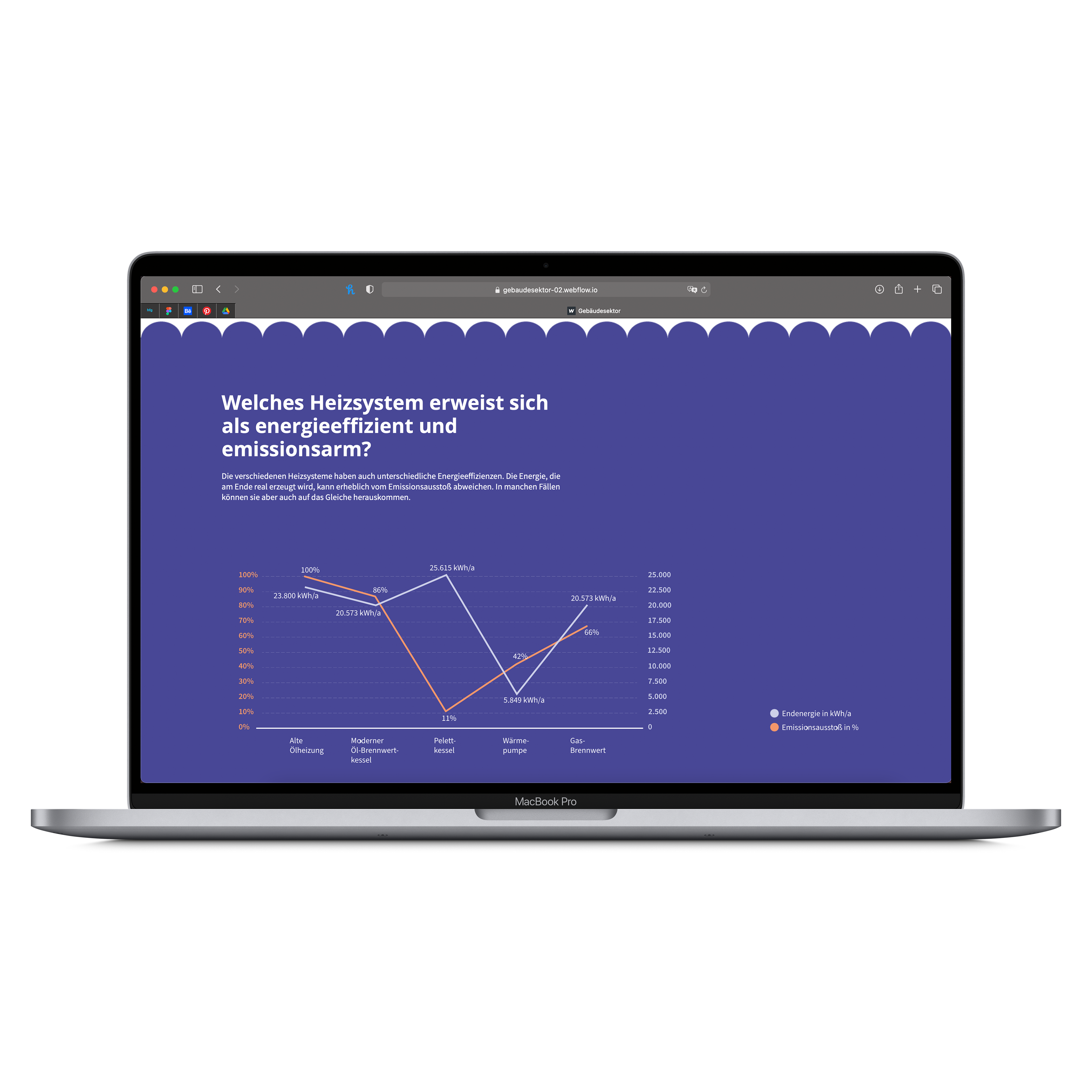
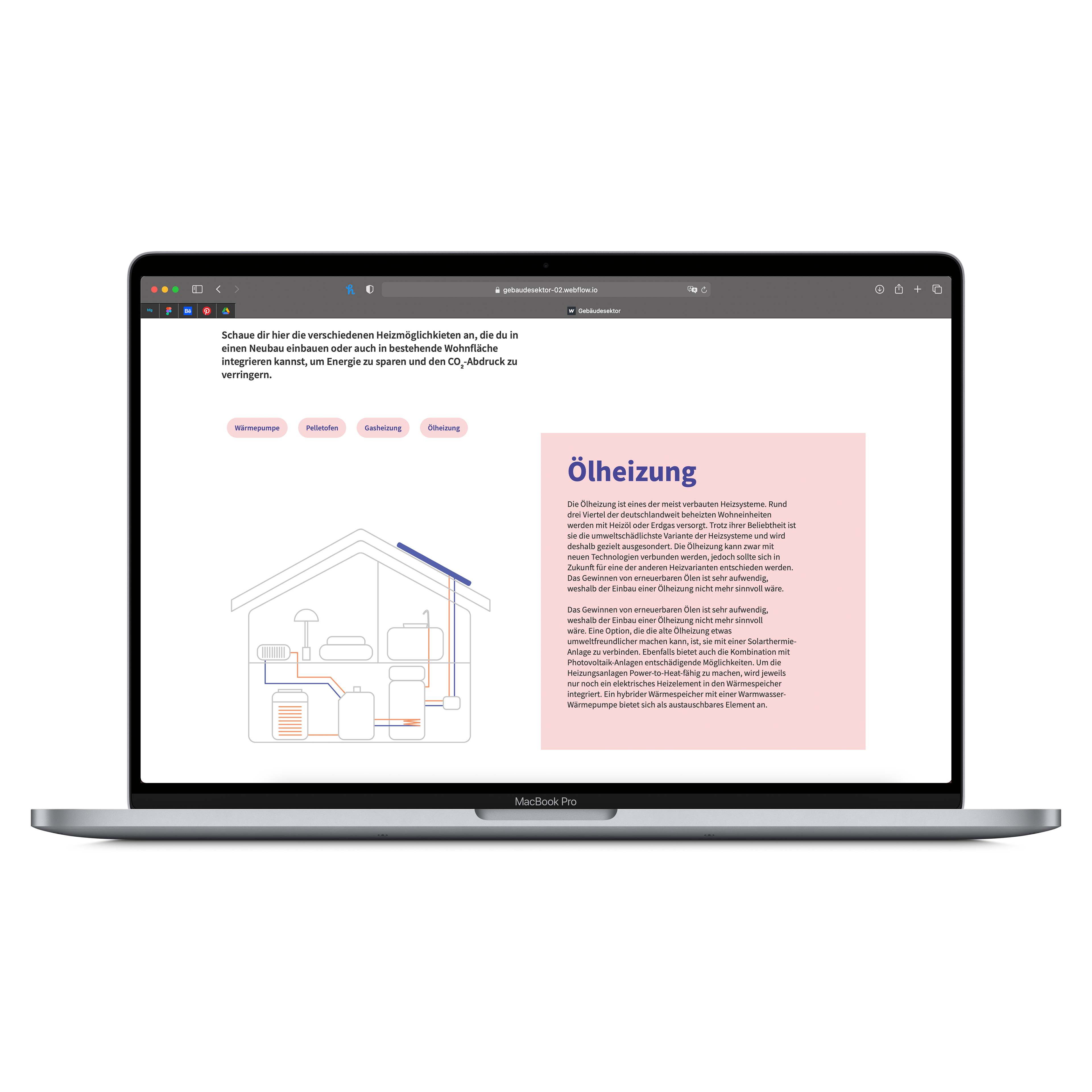
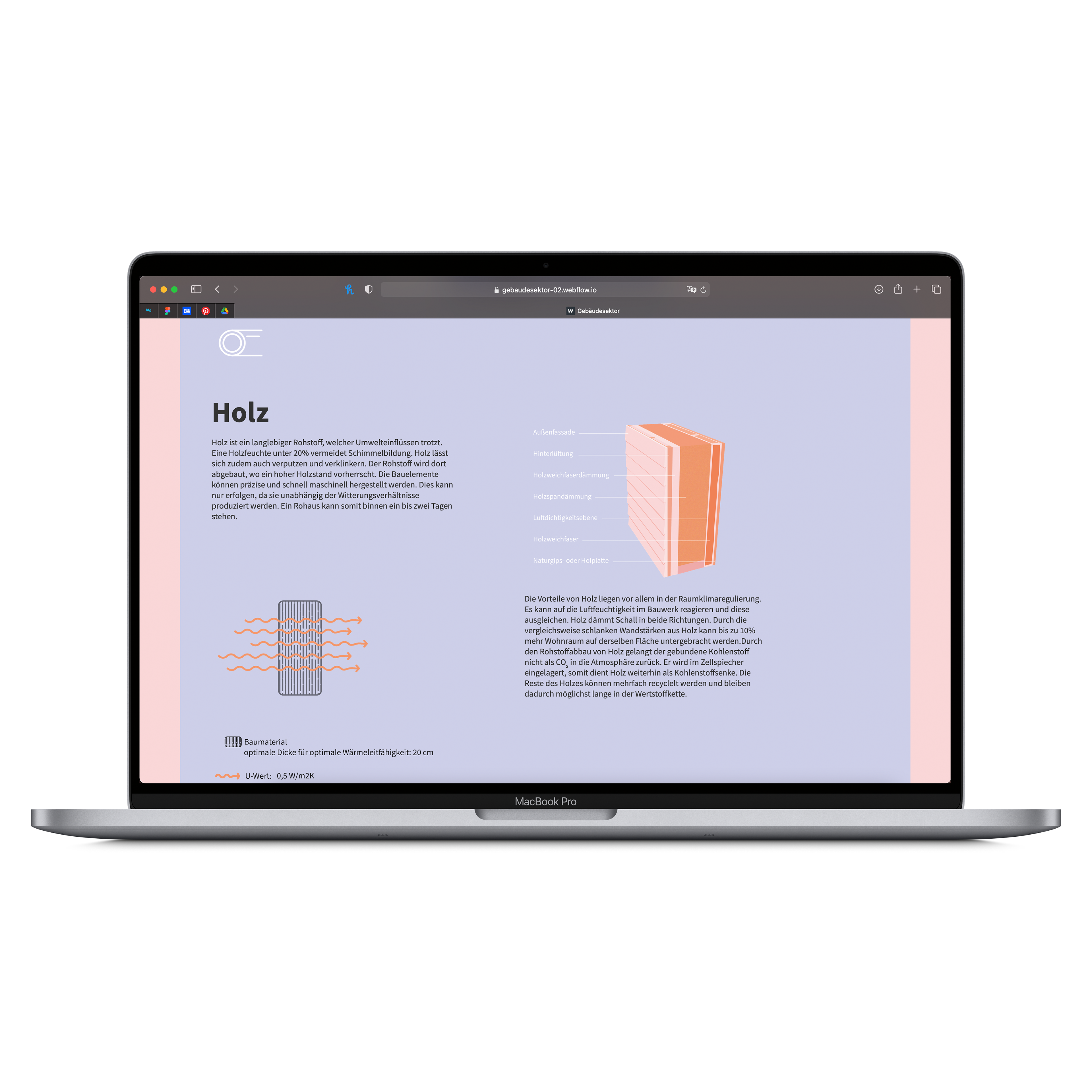
Our visualization informs the user about the serious emissions in the building sector and more sustainable solutions. The task was to explain the complex issues and solutions using graphical representations in an exciting and clear way and to provide the user with effective information. On the basis of diagrams, illustrations, data graphics or pictograms, the respective topic is presented in a comprehensible way.
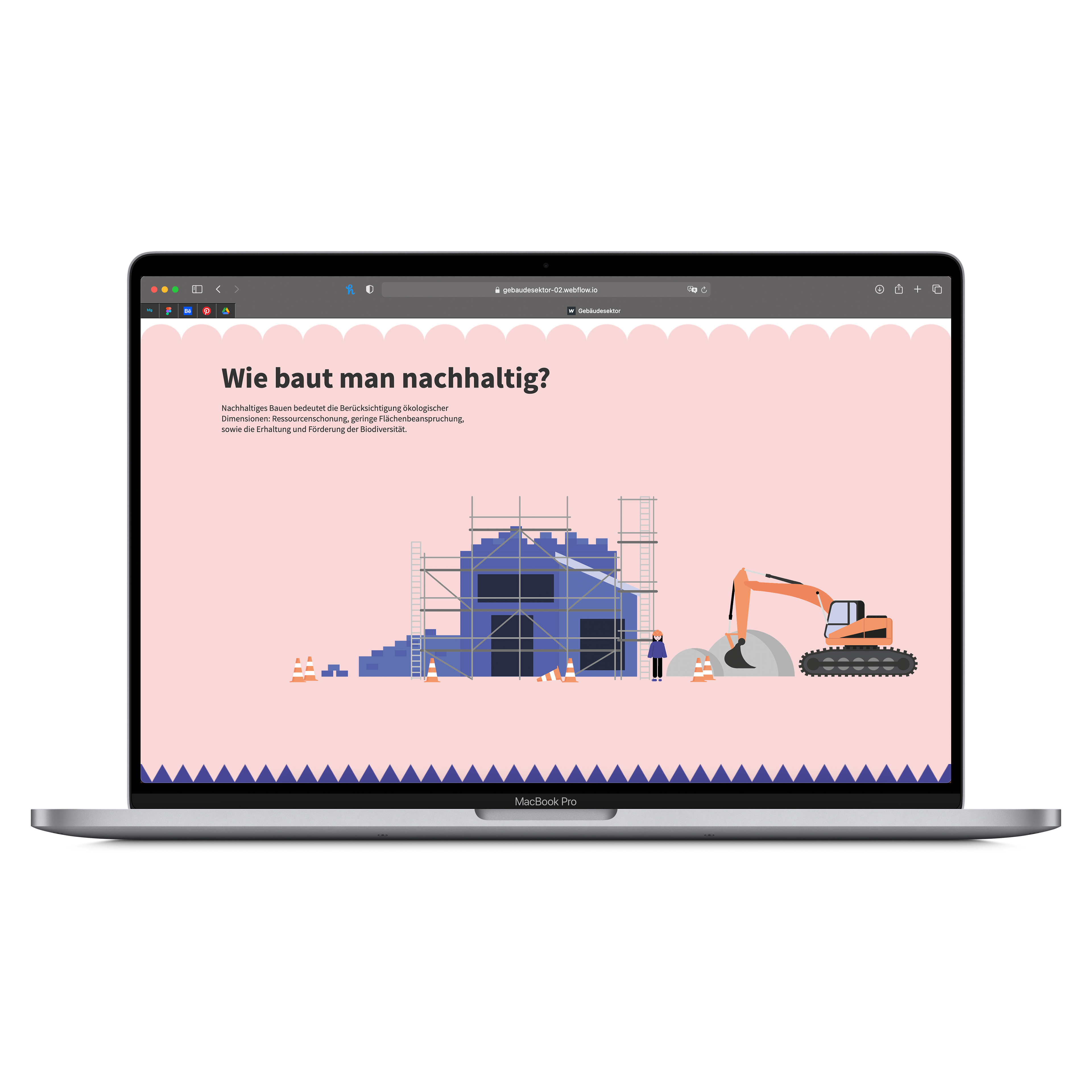
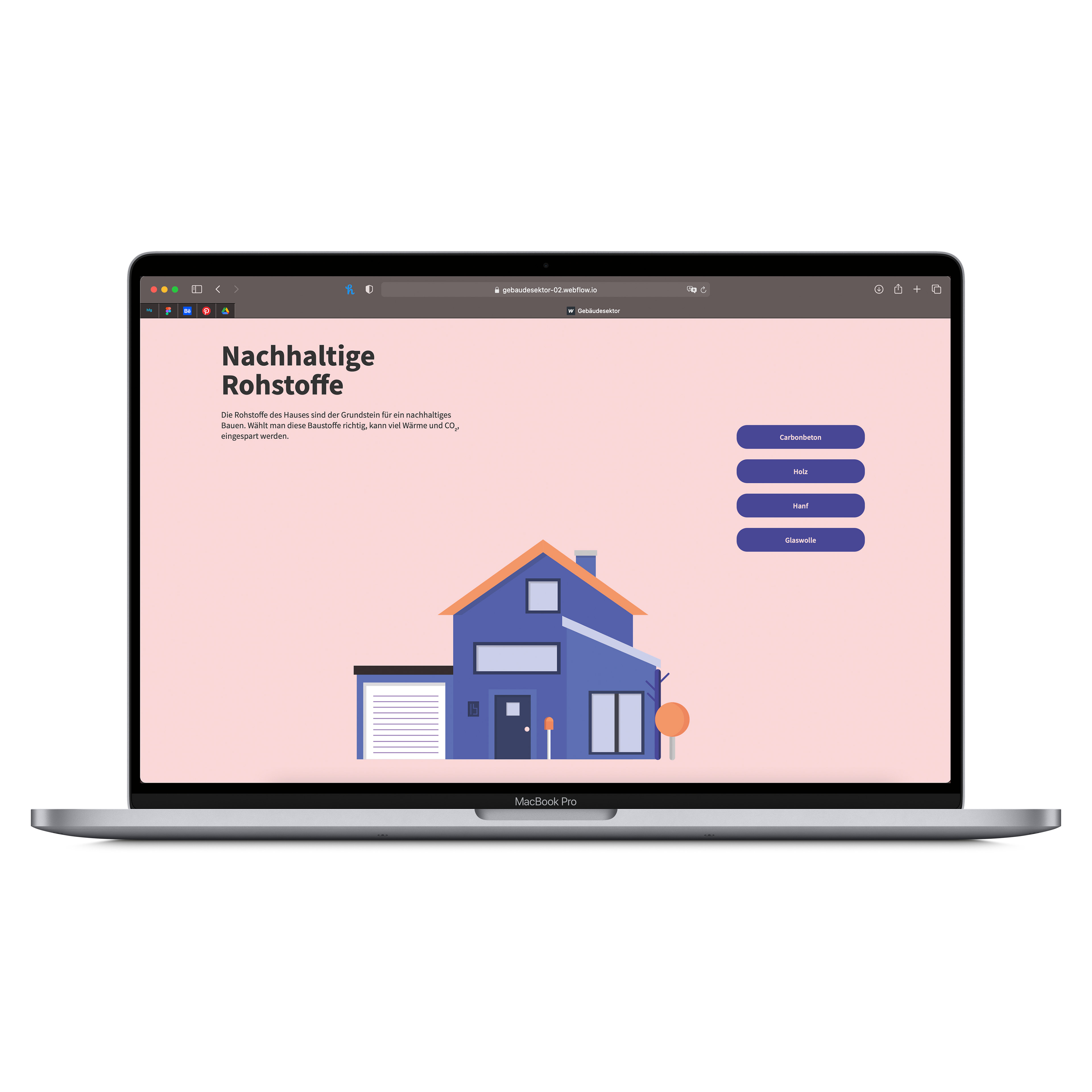
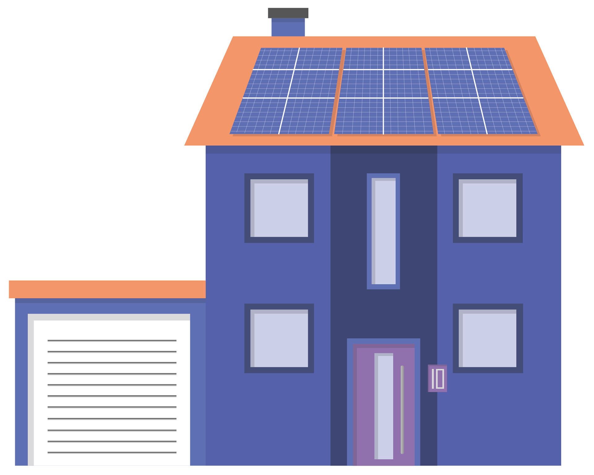
My Teampartner and I had to split up the work because we were only a group of two people. So a part of my task was to create the illustrations, data graphics and visual effects. Because of the color choice, none of the images are illustrated in a realistic way, if you compare them with the colors of the houses and nature in real live.

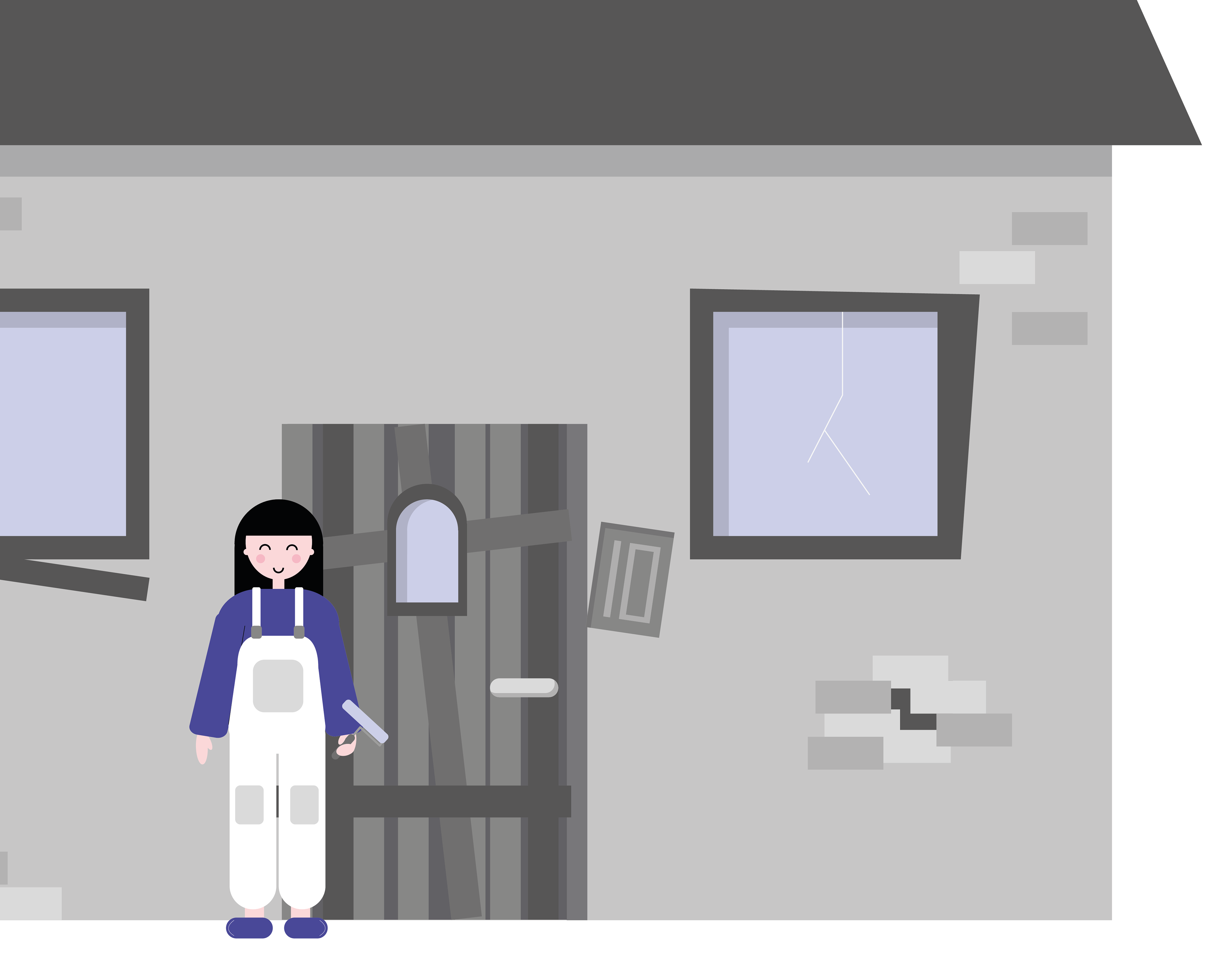
In an interactive way, the user can wander through our website and decide for themselves which areas they want to take a closer look at. We have also included a character on the website that guides the viewer almost “playfully” through the individual sub-topics of the building sector. Friendly, abstract illustrations are intended to lend a sense of lightness to the subject. The colourful display makes it easier for the user to have pleasure in taking a closer look at the problems.
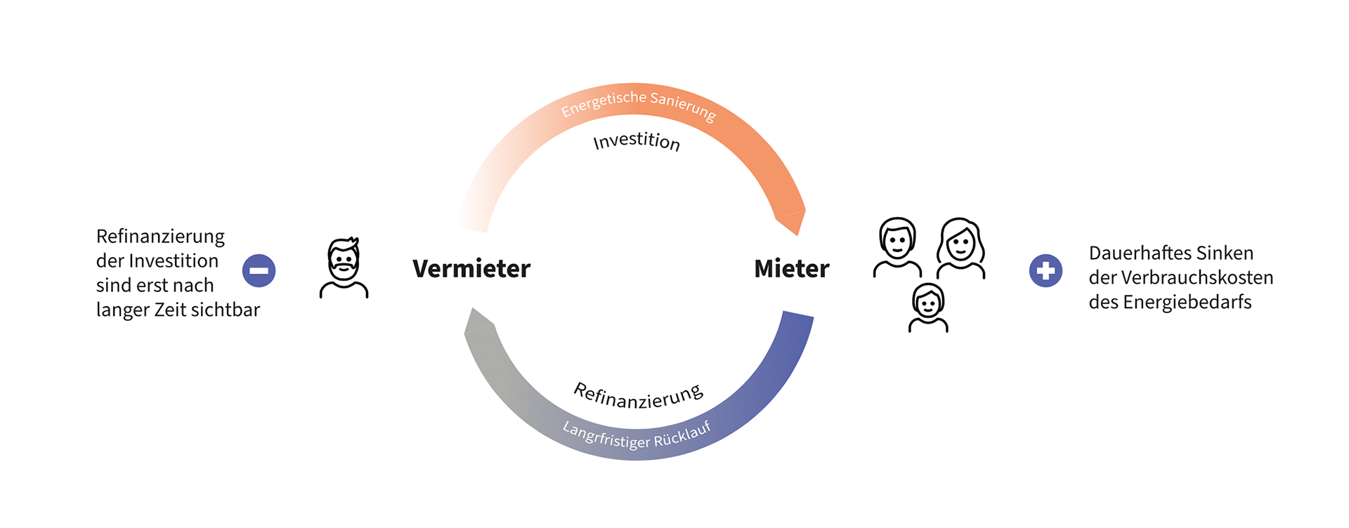
On the other hand, the graphic data graphics do not lose the connection to the importance of the topic.
the final website