semester
KG3
lecturer
Dominik Wizke
team
Yasmina Khalil
Jannis Braun
Daniel Fleer
tools
Adobe Illustrator
Figma
Redesign Wikipedia
In the course “Interactive design”, we should redesign an existing website, which in our opinion isn't a good example for usability. My Team and I chose to redesign the world-famous Encyclopedia Wikipedia.
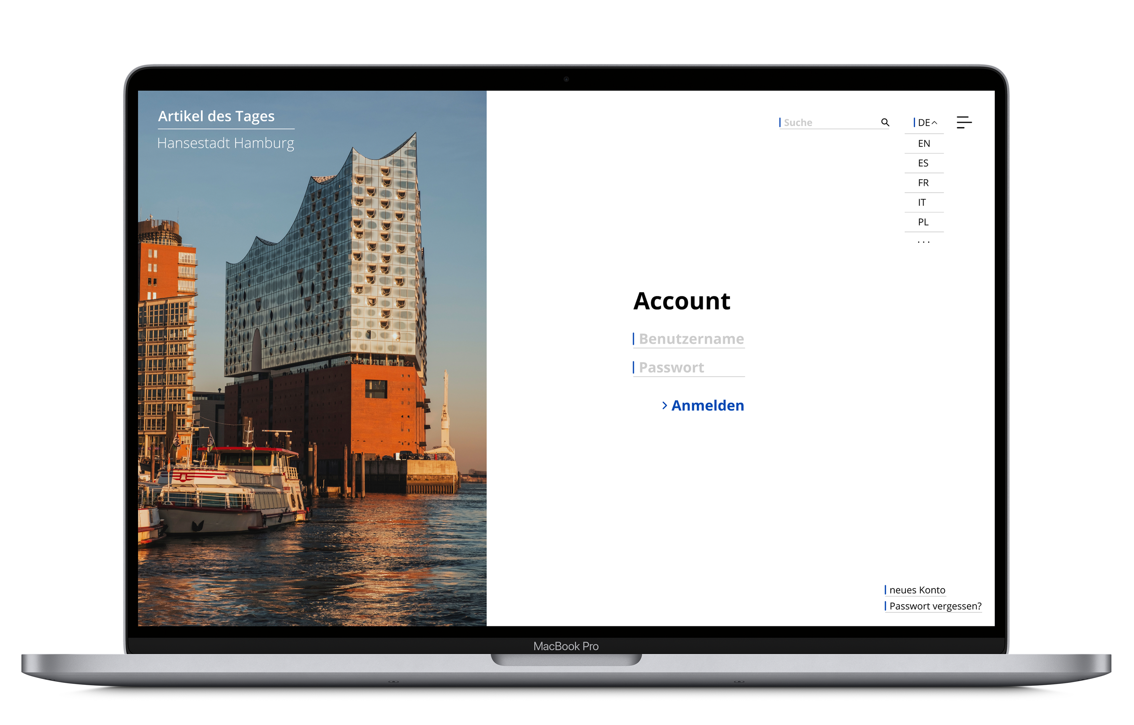
We learned user-friendly design in the web and that usability already starts with the atoms of the page. We also gave the home page and the login page a cleaner and more minimalistic look.
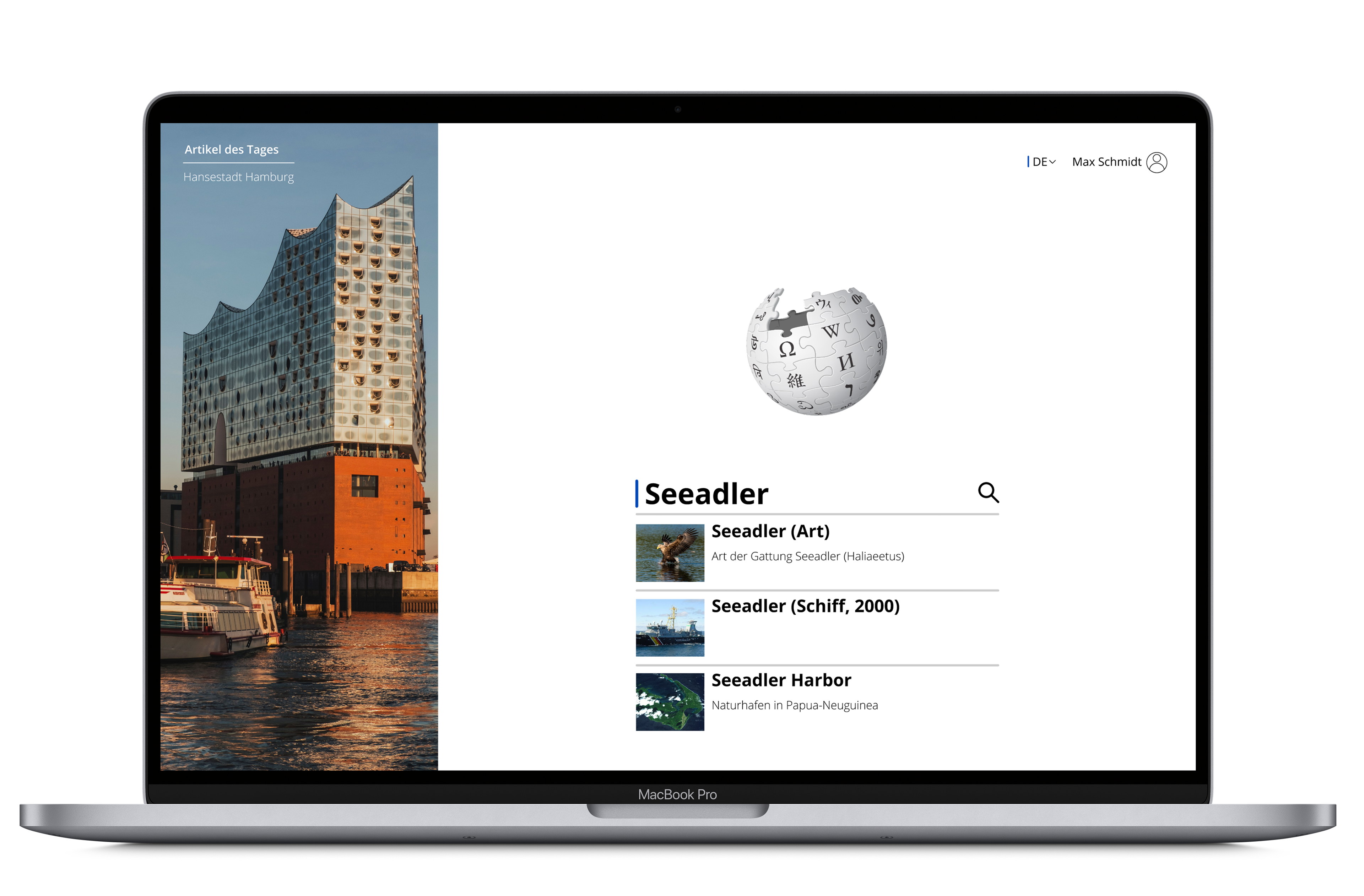
In our version of Wikipedia, we also tidied up the article page. Now, the reader can focus more on the content and is no longer distracted by too wide text fields and different fonts, as well as avoidable additional options.
Furthermore, in a quick access and a menu, the user can clearly see what possibilities they have to contribute to the platform, for example by creating an account. Some functions have been revised and remain unchanged.
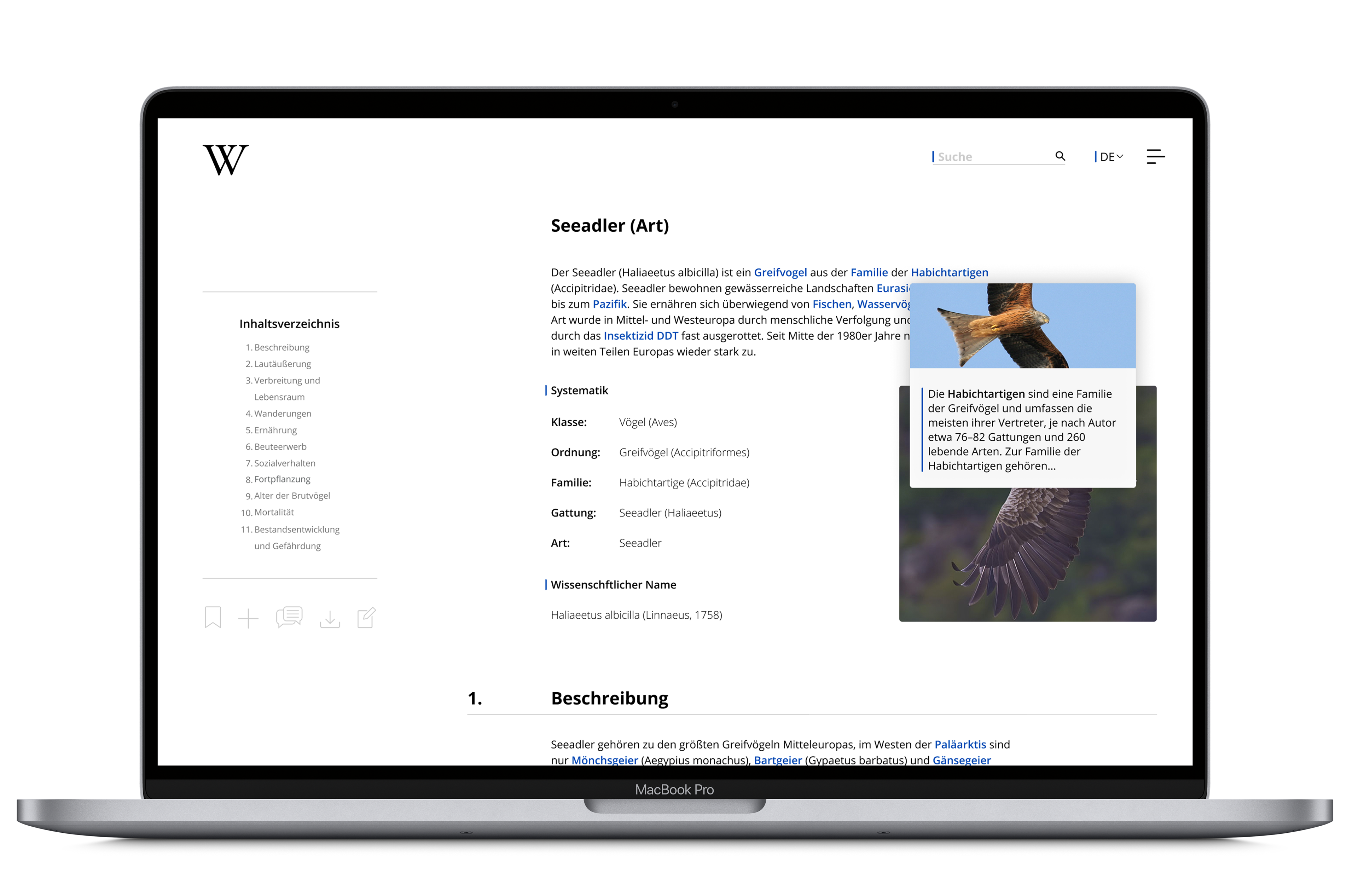
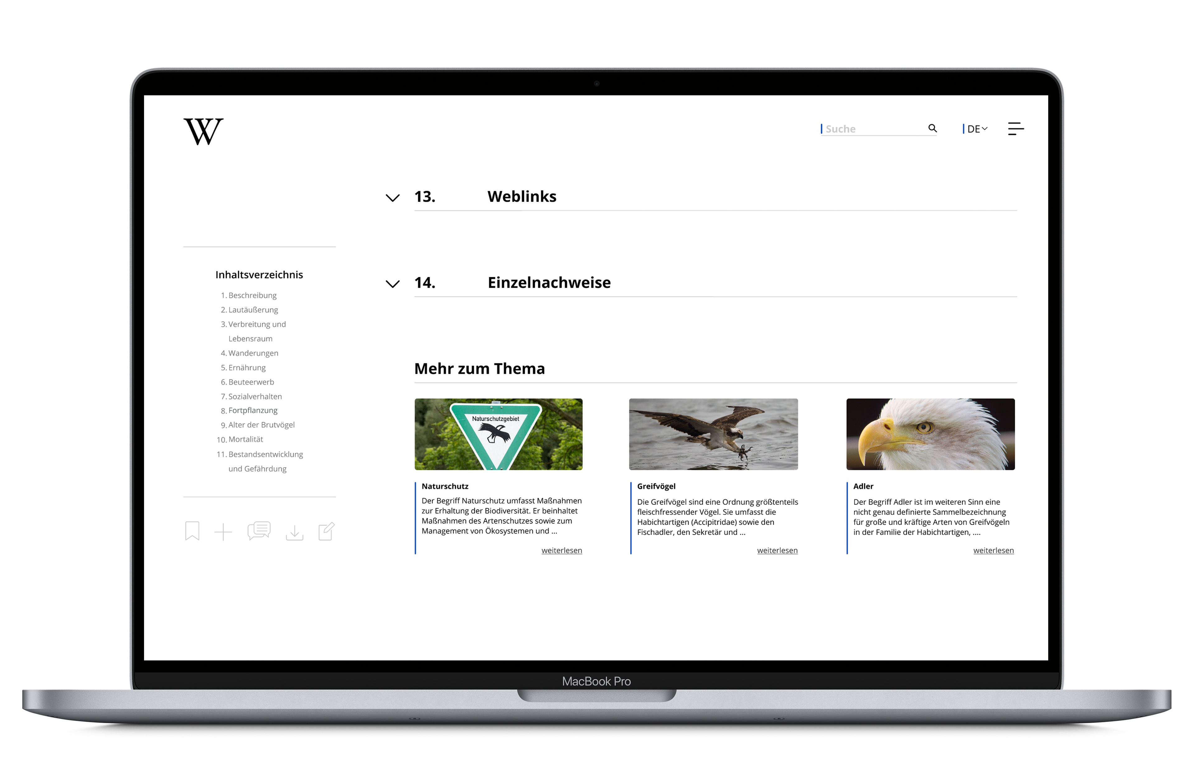
The page has retained the hoverlinks, the logo or the now fold-out and proofs that ensure the recognition value for which Wikipedia is known.
the final product
